
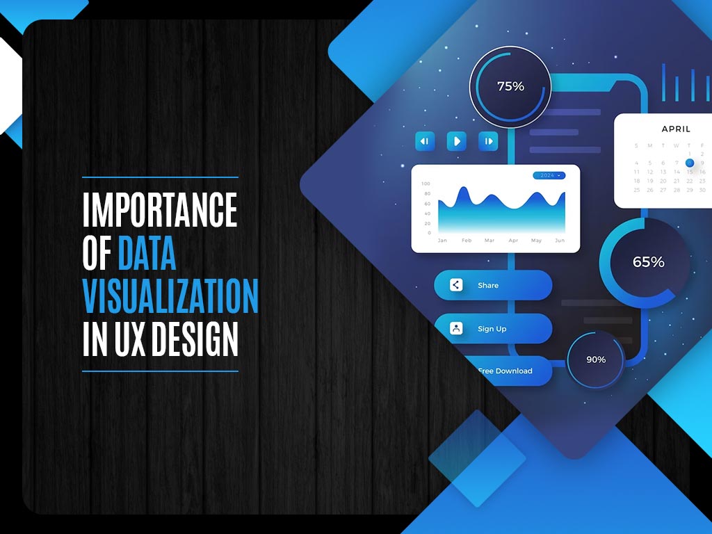
Importance of Data Visualization in UX Design
Data Visualization is an essential part of UX design, as it provides users with a more intuitive way to understand complex data.
In the digital age, user experience (UX) design has become paramount for the success of any software, website, or application. UX designers are tasked with creating intuitive, engaging, and user-friendly interfaces that cater to the needs and preferences of their target audience. A significant aspect of achieving this goal is leveraging data visualization techniques. Data visualization not only enhances the aesthetics of a design but also plays a vital role in conveying complex information, fostering user engagement, and making informed design decisions.
In this blog, we will explore the importance of data visualization in UX design, highlighting its benefits and best practices.
The Power of Data Visualization
Data visualization, a fundamental component of effective UI and UX design, is the practice of representing data in graphical or pictorial form. This approach makes it significantly easier for users to understand, interpret, and interact with complex information. In UX design, data visualization serves several crucial purposes, playing a vital role in enhancing the user experience, a skill often taught in a comprehensive UI and UX Design Course.
1. Simplifying Complexity
Data visualization is a powerful means of simplifying intricate data sets, transforming them into visually intuitive representations. Through charts, graphs, and interactive visuals, UX designers distill complex information into digestible formats that users can quickly grasp.
2. Enhancing Decision-Making
In the context of UI and UX design, data visualization empowers designers to make informed decisions. By presenting user behavior, feedback, and analytics through intuitive visualizations, designers can identify pain points, optimize interfaces, and prioritize improvements effectively.
3. Increasing User Engagement
Engagement is at the heart of UI and UX design, and data visualization plays a pivotal role in achieving this goal. Interactive charts, real-time data updates, and engaging graphics capture users’ attention and encourage them to explore and interact with the content, fostering a deeper and more satisfying user experience.
4. Effective Storytelling
Data visualization can be a compelling storytelling tool in UI and UX design. When combined with narrative elements, visualizations create immersive and memorable user journeys. These data-driven stories educate users while emotionally resonating with them, fostering a more profound connection with the interface.
5. Accessibility and Inclusivity
UI and UX designers must ensure that their designs are accessible to all users, including those with disabilities. Data visualizations can enhance accessibility by providing alternative text for visual elements, maintaining color contrast for readability, and using accessible chart types, all of which contribute to a more inclusive user experience.
Data visualization, as taught in a UI and UX Design Course, empowers designers to transform complex data into user-friendly interfaces that not only convey information effectively but also engage and delight users. It is a skill set that continues to be integral to the field of UI and UX design, enriching digital interactions and elevating the overall user experience.
Types of Data Visualizations in UX Design
Data visualization comes in various forms, each serving specific purposes in UX design. Some of the most common types include:
1. Charts and Graphs
Charts and graphs, such as bar charts, line charts, and pie charts, are excellent for presenting quantitative data. They help users understand patterns, trends, and comparisons within data sets.
2. Heatmaps
Heatmaps provide a visual representation of user interactions, showcasing where users click, move their cursors, or spend the most time on a webpage. This information is invaluable for optimizing user interfaces.
3. Infographics
Infographics combine text and visuals to explain complex concepts or processes. They are highly effective for presenting data-driven stories or conveying step-by-step instructions.
4. Dashboards
Dashboards offer a comprehensive view of multiple data points or metrics on a single screen. They are commonly used in applications and websites that require users to monitor various aspects of their accounts or performance.
5. Flowcharts and Diagrams
Flowcharts and diagrams are instrumental in illustrating processes, workflows, and decision trees. They help users understand the logical flow of actions or concepts.
Best Practices for Effective Data Visualization in UX Design
To harness the full potential of data visualization in UX design, consider these best practices:
1. Know Your Audience
Understand your target audience’s preferences, cognitive abilities, and expectations. Tailor your data visualizations to align with their needs and comprehension levels.
2. Prioritize Clarity and Simplicity
Simplicity is key. Avoid cluttering visuals with unnecessary details, and use clear labels and legends. Keep color schemes simple and ensure high contrast for readability.
3. Provide Context
Contextualize your data visualizations to help users understand the significance of the presented information. Include titles, subtitles, and explanations where necessary.
4. Ensure Responsiveness
Incorporate responsive design principles to ensure that data visualizations adapt seamlessly to various screen sizes and devices, providing a consistent experience for all users.
5. Test and Iterate
User testing is essential. Gather feedback on the effectiveness of your data visualizations and be prepared to iterate based on user input. Conduct A/B testing to determine which visualization types perform best.
6. Consider Accessibility
Follow accessibility guidelines to make data visualizations usable for individuals with disabilities. Provide alternative text for non-textual elements and use accessible colors and fonts.
7. Use Animation Wisely
While animation can enhance engagement, use it judiciously to avoid overwhelming users. Ensure that animations serve a purpose, such as highlighting changes in data over time.
Real-World Examples
Let’s explore some real-world examples where data visualization has played a pivotal role in enhancing UX design:
1. Google Analytics
Google Analytics employs various data visualizations, including line charts and bar graphs, to help website owners understand their traffic, user behavior, and conversion rates. These visualizations simplify complex data sets, enabling users to make data-driven decisions about website optimization.
2. Spotify’s Year in Review
Spotify’s “Year in Review” campaign uses data visualization to engage users by showcasing their listening habits over the past year. Users are presented with personalized infographics and data-driven insights, creating an emotional connection with the brand.
3. COVID-19 Dashboards
During the COVID-19 pandemic, numerous organizations and government agencies created data dashboards to inform the public about the spread of the virus. These dashboards, often featuring maps and interactive charts, provided critical information in an easily digestible format, helping users make informed decisions about their safety.
Conclusion
In conclusion, data visualization stands as a foundational pillar in the world of UI and UX design, imparting designers with the invaluable ability to transform intricate data into visually intuitive and engaging interfaces. Through the lens of a UI/UX Course, we recognize that data visualization serves a multitude of critical purposes, enhancing the user experience by simplifying complexity, guiding informed decision-making, boosting user engagement, facilitating effective storytelling, and championing accessibility and inclusivity. As technology continues to advance and user expectations evolve, the role of data visualization remains indispensable, enriching digital interactions and elevating the overall user experience. Embracing the principles of data visualization, designers can create interfaces that not only convey information effectively but also forge deeper connections with users, delivering an exceptional and impactful user experience in today’s ever-evolving digital landscape.