
How to Create B2B Social Graphics With Readable Text Using AI Image Tools
Learn how to create professional B2B social graphics with readable AI-generated text using structured prompts, the right layouts, and a quality-checking process.

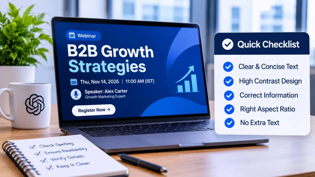
A demand-generation team needs a LinkedIn graphic for Thursday’s webinar: a headline, a date, a speaker line, and a clean background. The designer is booked, stock photos feel generic, and the first AI attempt produced a headline with two misspelled words.
Text is where most AI image workflows break down for B2B campaigns, because a single wrong letter makes a graphic unusable. Fixing it by hand in a design editor wastes the time you hoped to save. A ChatGPT image generator can serve as the first-draft step if you brief it carefully and check the output against a fixed review list, which is what this guide covers.
Decide What the Graphic Must Say
Before writing any prompt, reduce the message to the smallest text you can live with. A webinar card needs a title of six words or fewer, a date, and perhaps a speaker’s name. Anything longer, such as a full agenda, a legal disclaimer, or a URL, belongs in the post caption or added later in your layout software.
Image models handle short, high-contrast strings far better than paragraphs. Treat every extra line as a chance for error. Write the exact copy in a separate document first, because you will compare the generated result against it letter by letter.
Write a Prompt That Separates Text From Design
Mixing copy and styling in one sentence invites mistakes. Structure the brief in labeled parts so the model can tell which words to render and which words to interpret.
- Subject and purpose: “LinkedIn announcement graphic for a B2B marketing webinar.”
- Exact text: the headline in quotation marks, with a note such as “render only this text, no other words.”
- Layout: where the headline sits, how much empty space remains, and where a logo will be added later.
- Style: flat vector, muted blue palette, simple abstract shapes, no people.
- Format: aspect ratio matched to the channel.
Matching the ratio matters more than people expect. Use 1:1 or 4:5 for feed posts, 16:9 for webinar landing pages and slide decks, and 9:16 for stories. Generating at the wrong ratio and cropping afterward often cuts off the headline.
Run a Controlled First Pass
Generate several variations from the same prompt rather than rewriting it each time. Changing one variable per run, such as the palette or the headline position, shows you what actually caused an improvement. If you rewrite everything between attempts, you cannot tell why a result got better.
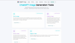
The step itself is simple. Open the ChatGPT image tool, paste the structured prompt, choose a model, set the aspect ratio and resolution, and generate. If you already have a brand photo or an earlier graphic, upload it as a reference image and describe what should change and what must stay fixed. Then open each result at full size and compare the text with your source document, because the tool produces candidates and a person still has to approve them.
Model choice is another variable worth testing. The site lists several models, and its own guidance suggests running the same prompt across more than one when a project is important. Keep the prompt identical so the comparison stays fair.
A concrete example shows the logic. Suppose the brief is a report cover reading “2027 Pipeline Benchmarks” on a dark navy background. Run four variations at 16:9, then change only the headline position and run four more. If the year or the word “Benchmarks” breaks in more than half the outputs, shorten the title or increase the contrast instructions before you spend time on style.
Be realistic about limits. Output quality varies by model and by prompt, and no setting guarantees correct spelling every time. Resolution options differ between models too, so confirm what the model you selected actually offers before promising a print-size or large-banner file.
Review Every Output Against a Checklist
Reject any graphic that fails a single item below. Partial credit does not exist for published text.
- Every word is spelled exactly as in your source copy, including capitalization and punctuation.
- Numbers, dates, and names are correct, not merely plausible.
- Text stays readable when the image is shrunk to roughly phone-feed size.
- Contrast between letters and background is high enough to read without squinting.
- No stray characters, invented logos, or extra words appear anywhere in the frame.
- Nothing resembles a real person, competitor mark, or trademark you have no right to use
Also check the visual claims. If the image shows a dashboard or chart, remember that it is decorative and contains no real data. Do not present it as a product screenshot or as evidence of results.
Fix Small Errors Without Starting Over
When the layout is right and one word is wrong, regenerating from scratch rarely helps. Two routes work better. First, upload the near-correct image as a reference and ask for a single targeted change while stating that everything else must remain identical. Second, export the background and add the headline in your usual design software, where typography is fully under your control.
The second route is often the safer one for anything customer-facing. Treat the generated picture as artwork and let a layout tool handle brand fonts, exact logo placement, and legal text. Brand and legal review still happens outside the image-generation step, and it should happen before anything is published.
Keep a record of prompts that passed review. A short library of approved structures, such as webinar card, report cover, and event teaser, lets the next campaign start from a tested brief rather than a blank box
Conclusion
Readable text in AI-generated marketing graphics comes from process, not luck. Cut the copy to a few words, separate the exact text from the styling instructions, match the aspect ratio to the channel, and compare several runs of one prompt before changing anything else.
Then review every candidate against the source copy and reject anything with a single error. For small flaws, use a targeted reference edit or move the text into a design editor. A team that follows this routine can fill a Thursday deadline with a graphic that holds up under scrutiny.