

I drafted our webinar registration page before the web team had a slot
A marketer drafts a webinar registration page for the web team's ticket: four form fields, the routes weighed, and what stays with legal and sales ops.Focus keyword: webinar registration page


Our next webinar has a date and two confirmed speakers, and nobody can register for it.
The session is called Fixing the lead handoff between marketing and sales: forty-five minutes, live, with our head of demand gen and a sales ops lead. The first invitation email is already built in the marketing automation platform, a big button in the middle and no URL behind it, because the page doesn’t exist yet.
Pages on our site go through the web team, and their queue is a wait measured in weeks, product launch first. A registration page for a mid-funnel webinar sits near the bottom of everyone’s list except mine. Their intake form asks for the copy, the form fields, the campaign and a wireframe or reference page.
So I drafted the page myself, as the wireframe for the ticket. It was never going to go live like that. I wanted the web team to open a file on the day they picked the ticket up and find every decision on my side already made.
Settle the page before you open any tool
Four fields, and the one I left off
The form asks for full name, work email, company and job title. Phone was the obvious fifth and I cut it. People who sign up for a webinar like this are curious, mostly nowhere near a buying conversation, and a phone field tells them a rep is about to ring. Sales can ask for a number later if the lead earns a call.
Country I’m still unsure about. It went into the ticket as a question for legal, since the consent wording we show can depend on where the person sits.
Brief it like a freelancer
I wrote the description as I would brief a freelance designer: a registration page for a free B2B webinar, the title, the length, two speakers by role, the four fields. I asked for three agenda points and a who-should-attend section without writing them out; the speakers hadn’t sent their outline, and I wanted a first pass to react to.
The date stayed out on purpose. It had moved once already, and I wanted it in one line I would type by hand.
The routes I weighed
I wrote down four routes before picking one.
| Route | What you need first | What you get | Who finishes it |
| Wait for the web team | A ticket and a slot in the queue | A page on our site, wired to our forms | The web team, when the slot comes |
| Unbounce | A trial account | A landing page platform with A/B testing built in | The account owner, after a vendor review |
| HubSpot AI website generator | An account and a free trial | A generated site inside HubSpot | Your HubSpot admin |
| Generate the file myself | A clear description | One HTML file | The web team, from a smaller ticket |
Unbounce
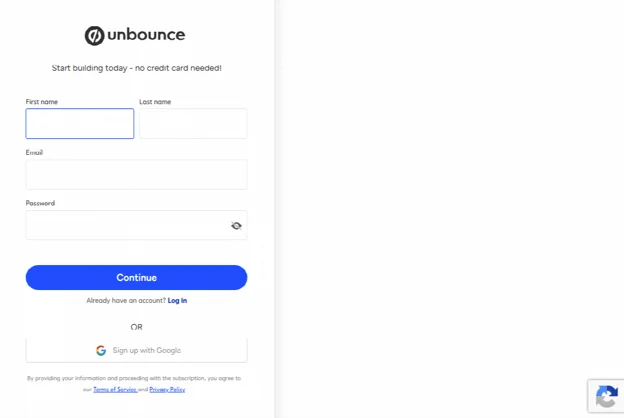
Unbounce is a landing page platform built for marketers, and A/B testing is right on its home page. For a paid campaign page I meant to test for a quarter, I’d build there. Start building for free opens a sign-up form for your name, a work email and a password, no credit card needed. At my company, any new vendor account that collects lead data goes through a security review first, and that review has its own queue.
Unbounce’s trial starts with this sign-up form, before there is a page to work on.
HubSpot’s AI website generator
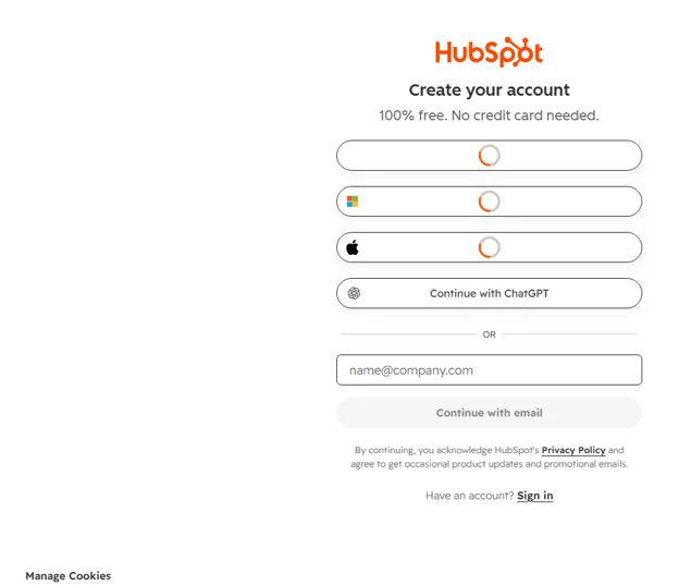
HubSpot’s generator page leads with a free trial button, which goes to Create your account: no credit card needed, carry on with just an email. If your team already lives in HubSpot, start there and skip the rest of this. We run a different automation platform, so for us it meant a trial in a system nobody here administers, holding registrations nobody planned to sync.
HubSpot’s generator starts at Create your account, with an email box under the sign-in buttons.
Making the working draft
What went into the form
I made the draft in Rewind’s free ai website builder, a single form that works without an account. Of the labels above it, I looked for Commercial use OK first; a company event page is commercial use.
Website Type: Landing Page. Color Scheme: Bold / High Contrast, because I wanted the form to be the loudest thing on the screen; the web team will swap in our brand colours anyway. Only Home got a tick among the pages. On a registration page, every extra page is somewhere to wander off to. As extras I typed “responsive, registration form above the fold, speaker cards” and pressed Generate.
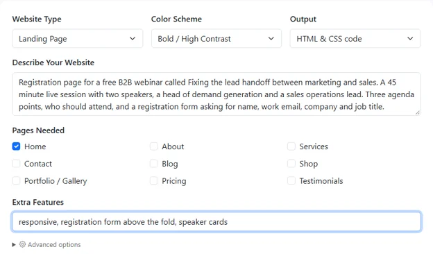
One page, a loud colour scheme, and the extras I cared about.
The file
The result arrives below the form as a single HTML file with its styling included at the head, ready to copy or download. Mine downloaded as rewind-result.html. I renamed it and double-clicked it.
The page is black, FIXING THE LEAD HANDOFF in green capitals over a line about revenue lost in the gap between marketing and sales. Then the form, where I’d asked for it: Full Name, Work Email, Company, Job Title and a full-width green button reading SECURE MY FREE SPOT. Below that sit the agenda, two bordered speaker cards and a Who Should Attend line naming marketing managers, sales operations, RevOps leaders and demand generation specialists. That line went into the ticket a second time, as targeting notes for the paid promotion.
At phone width the page stacks into one column with the form still on top, which is how a lot of registrants will meet it, tapping through from the invitation email.
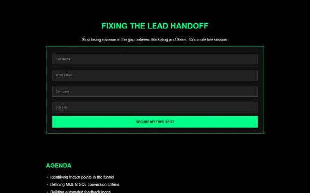
Opened from my downloads folder, with the four fields and the green button straight under the headline.
What I filled in myself
In a text editor I added a line under the headline with the date, time and time zone, and put the speakers’ names and titles in their cards. The agenda’s three lines (friction points in the funnel, MQL to SQL criteria, automated feedback loops) stay until the speakers send their outline.
SECURE MY FREE SPOT is louder than anything we usually publish. I kept it; house style is the web team’s call.
Then I sent the file to both speakers so they could see their cards first.
What stays with other people
A form in a plain HTML file doesn’t send anywhere on its own. Press the green button on my draft and nothing reaches our database. I knew that going in; the wiring belongs to three other teams.
Web team
They rebuild the form in our marketing automation platform so each registration lands as a contact in the campaign, with hidden UTM fields so I can see which channel brought whom. The thank-you page, confirmation email, calendar file, analytics tags and URL are theirs as well.
Legal
The consent line under the form: what someone agrees to by registering, whether sales may follow up, the privacy policy link, and the country question. I don’t write consent text, and I left no placeholder on the draft that anyone could mistake for approved wording.
Sales ops
Where a registrant goes after the button: lead status, who follows up and how soon, what happens to people who register and never show. Given the webinar’s title, I watch this one hardest. A session on the lead handoff whose own registrants sit in a list nobody owns would be a poor advert for both speakers.
The handoff ticket
What I filed, in the order the web team reads a ticket:
- The draft, renamed webinar-lead-handoff-draft.html. Open it in a browser; layout and copy are the brief.
- Preferred URL and the CRM campaign.
- Form: the four fields, all required, free email domains blocked if possible. No phone.
- Hidden UTM fields, lead source set to webinar.
- Consent text pending from legal, country question attached.
- Thank-you page with the date, a calendar file and a line saying registrants get the recording.
- Speaker headshots.
- Routing: sales ops has the spec.
- The send date of the first invitation email, which is the real deadline.
I put that date in the subject line too, where nobody scrolling the queue can miss it.